Hi all,
In the scope of one of our project, an(other) evaluation of the accessibility of dotLRN has been carried out by experts. They provided us with recomendations to improve this aspect where it's necessary. This evaluation has been done on dotLRN 2.3.
Below, I detailed the issues and the recommendations as they have been described by the experts, I've added a couple of comments too. I know that this arrives a bit late since we are near to release dotLRN 2.4 (or so I hope) but maybe we (aDeNu group at UNED) still have time to implement some of them if the community agrees.
core:
Those are proposed to be implemented on head.
- Forms (can be done providing an alternative template):
- the "required" indication is outside the label tag. This means that the word is read by a screenreader in "normal" mode but not in "forms" mode which is required for completing forms. Recommendation: place the word "required" within the label tag.
- When there's an error submitting the form, the error message appears near the bottom of the field that caused the error, which screenreader users would not be aware of straight away. Recommendation: place an error message also at the top of the form indicating where the error(s) is.
- The red color used to highlight errors may not be perceived by everyone. Recommendation: provide an additional indication of the error: perhaps use the word "error" to precede the error message.
- The help messages appear after the field and therefore are read after the field. The user has to go back to fill the field. Recommendation: put the help prior to the input fields
- Dates format: those displayed as, for example, "04/16/07" are announced as numbers rather than dates by screenreaders. Suggestion - 16 April 2007 - using the words rather than the numbers helps in accessibility (a.k.a usability for all).
Theme-zen:
- Provide an accessibility page with explanation on how to switch between CSS, the list of the access keys and the max font size available. Consider putting the CSS switcher in the control panel instead at the top of the page.
- The "skip to main content" has to be visible always
- Improve the color contrast of the portlet headers (user and class portal). Those headers use a background image that is a gradient, the problem is in the lightest part of the gradient. (Dave already changed the class one). Probably using a plain color would be easier to meet the color contrast requirement.
- CSS: change absolute size to relative ones. When an user uses screen magnifier, some elements are lost on the right side and therefore are missed by the user, besides it causes a horizontal scroll which is annoying.
- breadcrumbs: would be useful to precede them with the text "You are here" esp. for screenreader users, because the purpose of the list is not obvious. The text can be made invisible using a style so will be only read by screenreader.
- accesskeys: it is recommended to use numbers instead of letters to avoid clash with browser and environment access keys (see http://www.openacs.org/forums/message-view?message%5fid=1490706)
Calendar:
- review the alternative text of the icons or better, put those icons in the CSS
- the form to go to a date lacks of a label.
- mini-calendar, week view and month view tables are not marked up as data tables. headers should be used to associate weekday with day.
- day schedule: the current day could be the table caption. a new row of headers could be added to identify the content of the columns such as "time" and "event". The times could also be coded as table headers.
- add-event form: reorder the fields of the date (according to the locale of the user). Use labels.
- not readable in HC mode (no CSS for that mode, we'll have to write one and find a way to make it switch too)
- Days in the calendar are announced as "link 1", "link 2", "link 3" which is not meaningful. Recommendation: add title to be read as "link 1 April".
File storage:
- portlet and folder-chunk: not all columns of the list have a header.
- Contrast of the filename is not sufficient (light grey on light blue)
Assessment:
- portlet: not all the columns of the listtemplate have a header.
LORSM:
- portlet: the summary of the table is "data for $course_name" (probably the default set by listtemplate when no summary is provided). The summary should be meaningful.
- SCORM player:
- There appear to be 5 frames although only two are actually visible. This issue also affects screenreader users and voice recognition users. Recommendations: If possible remove the two non-visible frames. If this is not possible provide frame names that will be meaningful to students. Do not include the word "frame" in the name of the frame because the screenreader will include that word.
- The expansion images in the menu frame have no alt text. Recommendation: provide an alt text that reflects the change in status.
dotlrn portlet:
- The "(--|++)" links are read as "dash dash plus plus" by a screenreader. anyhow, the purpose of those links is not obvious. Provide a text link or a meaningful title, don't just use ASCII chars. The best thing would be to use icons with their alt text.
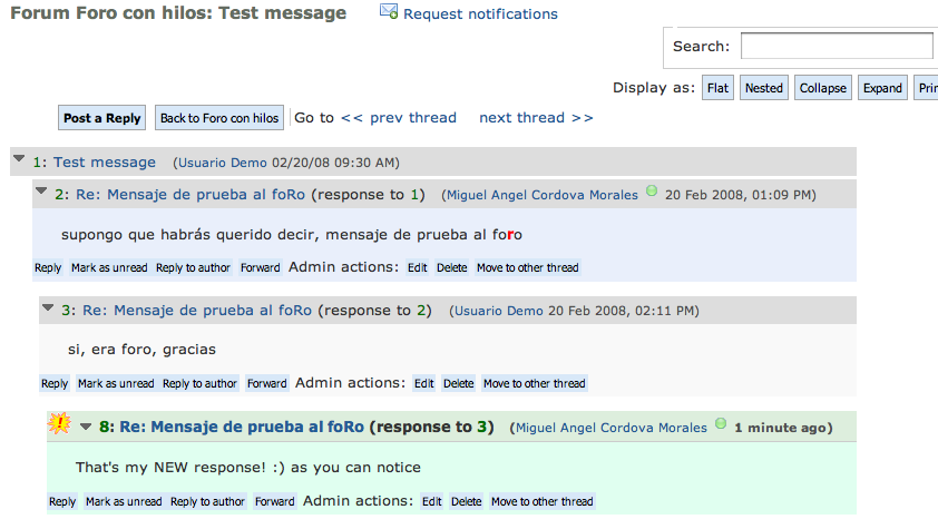
Forums:
- Recommendation: In the list of threads, mark up the subjects as headings so that a screenreader user can navigate from one thread to the next. (I don't think that template::list allows that)
- The "reply" and "forward" buttons appear before each message in the screenreader "read order". This is not useful because a screenreader user would have to navigate back past the message in order to get to these buttons. Recommendation: place these buttons after the message in the read order.
- At the beginning of each reply the arrow which has the alt text "plus" is not meaningful. Recommendation: change this alt text to "expand message" or "collapse message" depending on the status.
Thanks for reading until here. Looking forwards to your comments.
