
Assessment Admin UI
TODO LIST
- Update this page with the latest work
- Carl will fill in here...
The current UI is very confusing and cluttered.
Our vision of a final UI is that a assessment creator would pick a type of assessment he wants and the site will set all defaults appropriately for it. However, the first attempt to do this was a failure so we are working on an incremental approach that we think will provide value with minimal effort. Our intent is that later we move to an even friendlier UI.
Incremental Improvement Vision: The current user experience is: every time you create anything you are confronted by many many choices, most of which you can ignore. Similarly all the admin pages have many repeated buttons and its not clear when you want to do what. Thus our goal is:
- Creation pages are very very simple and useful defaults are set for everything.
- Objects then have one button to an Edit page that has all the complex things you can do with the object.
Related Pages:
- Assessment Admin Index
- One Assessment Admin Assessment one-a
Screenshots
These are screenshots of the work in progress.
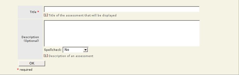
Simplified quick assessment creation form.
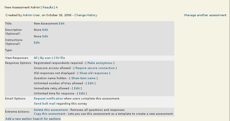
One Assessment Admin Page
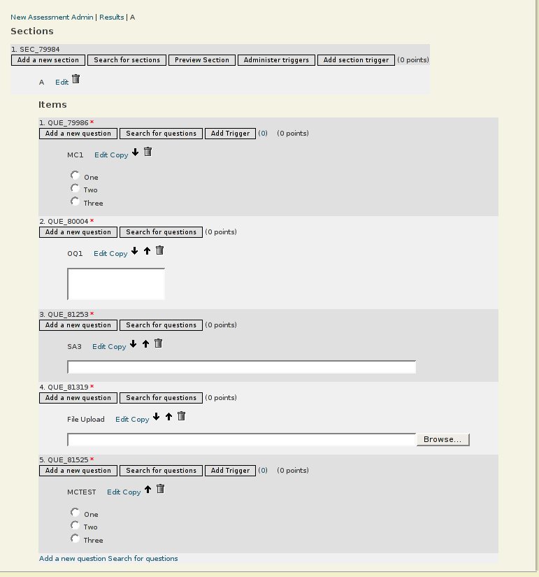
One Section Admin Page
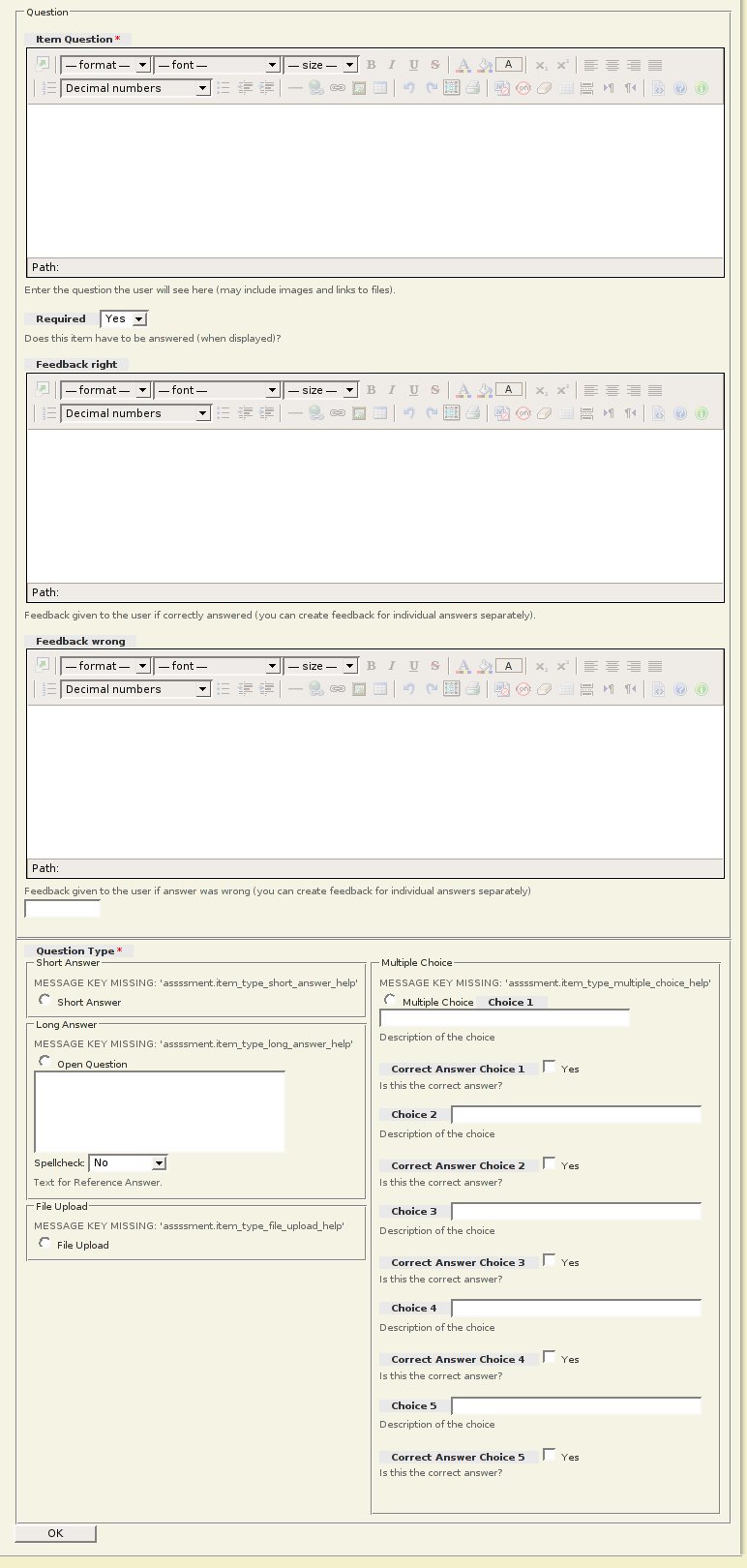
Add a question page.
First the original question form:
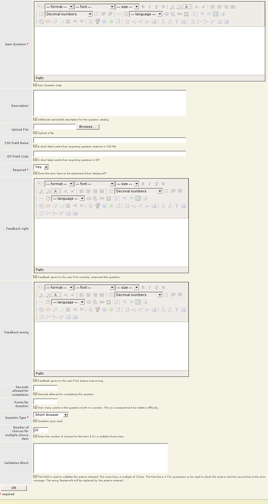
Now the new form. The question creation process used to require filling out 3 forms. We compressed it to one form by removing unused settings, and making intelligent default decisions. Some more work needs to be done. Assessment has a huge amount of complex features and it is not clear how they are used together to create a certain type of assessment. It is clear that all of the settings rarely need to be used together.
|
|||||||||||||||||||||||||||||||||||||||||||||
|
|||||||||||||||||||||||||||||||||||||||||||||
in last 30 minutes
OpenACS.org
- HOME
- News
- OpenACS Projects
- Activity Graph
- Admin Package RFC
- Bugtracker Cleanup Project
- Collaboration Graph
- Community Metrics in OpenACS
- Debian/Ubuntu installer developing
- Documentation Project
- Documentation Project Discussion
- Documentation Project Plan (Approach 4)
- {done} Change Log from OpenACS 5.4.2 to OpenACS 5.4.3
- {done} OpenACS 5.3.x releases
- {done} Release Notes OpenACS 5.4.3
- Dynamic Object Types and Attributes
- Ecommerce G2
- E-Mail: Event Handling
- E-Mail: Incoming E-Mail
- E-Mail: Outgoing E-Mail
- Forums Project
- GETable resources, that should be POSTable resources
- Interface / CSS Coding Guidelines
- Logo
- .LRN
- Mentorship Program
- Migration from CVS to GIT
- Official Test Servers
- OpenACS 5.10.0 Change Summary
- OpenACS 5.10.1 Change Summary
- OpenACS 5.9 HTML validity fixes
- OpenACS/.LRN for Debian
- OpenACS Packaging for Debian and Ubuntu
- OpenACS Release Status
- OpenACS TODO List
- Package Object Types
- Package Testing Process
- Prerequisites and Procedures for Migrating to Subversion from CVS
- Site Nodes Proposal (Draft)
- Site Wide File Upload
- Site Wide Image Upload Widget
- (Sketch for) OpenACS Home
- Theme Manager
- Theming Project
- Translation server for OpenACS packages
- User interface mockups
- Website_Redesign
- XoWiki Design Ideas
- YUI Project
- Marketing
- Our Website
- Packages
- Available OpenACS Packages
- Core Packages
- ACS Admin
- ACS API Browser
- ACS Authentication
- ACS Automated Testing
- ACS Bootstrap Installer
- ACS Content Repository
- ACS Core Docs
- ACS Default Theme
- ACS Developer Support
- ACS Kernel
- ACS Lang
- ACS Mail Lite
- ACS Messaging
- ACS Reference Data
- ACS Service Contract
- ACS Subsite
- ACS Tcl
- ACS Templating
- ACS Translations
- Intermedia Driver
- Notifications
- Reference Data - Country
- Reference Data - Language
- Reference Data - Timezone
- Search
- Tsearch2 Driver
- Non-Core Packages
- ACS Date Time
- ACS Events
- ACS Interface
- ACS Object Management
- Address Book
- Ad Server
- Ajax Filestore UI
- Ajax Helper
- Ajax Photoalbum UI
- Anonymous Evaluation
- Assessment
- Attachments
- Attendance
- Attribute Management System
- Auth CAS
- Authentication Server
- Auth HTTP
- Authorize.net Gateway
- Beehive
- Bookmarks
- Bookshelf
- Boomerang Plugin
- B Responsive Theme
- Bug tracker
- Bulk mail
- Calendar
- Calendar Includelet
- Cards
- Categories
- Chat
- Chat Includelet
- Clickthrough
- Clipboard
- CMS
- CMS News Demo
- Connections
- Contacts
- Contacts Lite
- Content Includelet
- Cookie Consent Widget
- Cronjob
- Curriculum
- Curriculum Central
- Curriculum Tracker
- Datamanager
- dbm
- Diagram
- Directory
- Download
- Dynamic Object Type
- E-Commerce
- Ecommerce Serial Number Tracking
- Edit This Page
- EduWiki
- Email Handler
- Evaluation
- Expense
- Expense Tracking
- EZIC Gateway
- Facebook API
- FAQ
- Feed parser
- File Manager
- File storage
- File Storage Includelet
- Forums
- Forums Includelet
- GateKeeper
- General comments
- Glossar
- Glossary
- Image Magick
- IMS Enterprise
- Imsld
- Invoices
- Jabber
- Lab Report
- Lab Report Central
- LAMS Integration
- LAMS Integration Configuration
- Latest
- Layout Managed Subsite
- Layout Manager
- LDAP Authentication Driver
- Learning Content
- Logger
- LORS management Includelet
- Mail Tracking
- MMplayer
- Monitoring
- New portal
- News
- News aggregator
- News Includelet
- Notes
- OCT Election
- openacs-bootstrap3-theme
- Organization
- Outdated Library functions
- Package Builder
- Page
- Pages
- PAM Authentication Driver
- Payment Gateway
- Permissions Administrator
- Photo album
- Planner
- Poll
- Postal Address
- Post Card
- Press
- Profile provider
- Project Manager
- Q-Forms
- Quota
- Q-Wiki
- Ratings
- Recruiting
- Redirect
- Reference Data - Currency
- Reference Data - ITU Code
- Reference Data - UNSPSC code
- Reference Data - US County
- Reference Data - US State
- Reference Data - US Zipcode
- Related Items
- Richtext CKEditor 4
- Richtext CKEditor 5
- Richtext TinyMCE
- Richtext Xinha
- Robot Detection
- RSS support
- S5
- Sample Gateway
- Schema Browser
- Scholarship Fund
- Scorm Core
- Scorm Importer
- Scorm Player
- Scorm Simple LMS
- Selva theme
- Shipping Service Contract
- Simple Survey
- Simulation
- Site-wide Search
- Skin
- SOAP db
- SOAP Gateway
- Spreadsheet
- Static Pages
- Survey
- Survey Library
- Survey Reports
- T Account
- Tasks
- Tcl SOAP
- Telecom Information
- Trackback
- User preferences
- User profile
- Value-based Shipping
- Version Control
- Views
- WebDAV Support
- Weblogger
- Webmail System
- Wikipedia
- Wimpypoint slim
- Workflow
- XCMS User Interface
- XML RPC
- XO Learning Performance
- xolirc
- xooauth
- XOTcl Core
- XOTcl Request Monitor
- xowf plugin for Monaco code editor
- xowf (XoWiki Workflow)
- XoWiki
- XoWiki Includelet
- ecommerce-g2
- Accounts Desk
- Accounts Finance
- Accounts Payables
- Accounts Payroll
- Accounts Receivables
- Bulk Upload
- CL Custom Commerce
- Customer Service
- E-commerce 2
- Fabrication
- Field Service
- General Ledger
- Human Resources
- Inventory Control
- Manufacturing Design
- Online Catalog
- Production
- Reference Data - GIFI
- Ship-Track
- Vendors-Suppliers
- DotLrn
- Anon Eval Applet
- Anon Eval Portlet
- Application track
- Application track Applet
- Application track portlet
- Assessment Applet
- Assessment portlet
- Attendance Applet
- Beehive Applet
- Beehive Portlet
- Bulk mail Applet
- Bulk mail Portlet
- Calendar Applet
- Calendar portlet
- Cards applet
- Cards portlet
- Chat Applet
- Chat Portlet
- Contacts Applet
- Contacts Portlet
- Content Applet
- Content Portlet
- Courses
- Curriculum Applet
- Curriculum Portlet
- Datamanager Portlet
- dotLRN
- dotLRN Administration
- dotLRN applet
- dotLRN Bootstrap 3 Theme
- dotLRN Course Catalog
- dotLRN Datamanager Applet
- dotLRN - Ecommerce
- dotLRN portlet
- dotLRN Roadmap
- Edit-this-page Applet
- Edit-this-page Portlet
- EduWiki Applet
- EduWiki Portlet
- Evaluation applet
- Evaluation portlet
- Expense-tracking Applet
- FAQ Applet
- FAQ Portlet
- File Storage Applet
- File Storage Portlet
- Forums Applet
- Forums Portlet
- Glossar Applet
- Glossar Portlet
- Homework Applet
- IMS-LD Applet
- IMS LD Portlet
- Invoices Applet
- Invoices Portlet
- Jabber Applet
- Jabber Portlet
- LAMS Integration Applet
- LAMS Integration Portlet
- Latest Applet
- Latest Portlet
- Learning Content Applet
- Learning Content Portlet
- LORS central
- LORS - Learning Objects Repository Service
- LORS management
- LORS management Applet
- LORS management Portlet
- Messages Applet
- Messages Portlet
- MMplayer Applet
- MMplayer Portlet
- News Aggregator Applet
- News Aggregator Portlet
- News Applet
- News Portlet
- Photo Album Applet
- Photo Album Portlet
- Private-Message
- Project-manager Applet
- Project Manager Portlet
- Quota Applet
- Quota Portlet
- Random-photo Applet
- Random-photo Portlet
- Recruiting Applet
- Recruiting Portlet
- Research Applet
- Research Portlet
- Static Applet
- Static Portlet
- Survey Applet
- Survey Portlet
- Syllabus Applet
- Tasks Applet
- Tasks Portlet
- Theme Zen
- User Tracking
- User Tracking Applet
- User Tracking Portlet
- Weblogger Applet
- Weblogger Portlet
- Wikipedia Applet
- Wikipedia Portlet
- Wimpypoint Slim Applet
- Wimpypoint Slim Portlet
- XoWiki Applet
- XoWiki Portlet
- Contrib Packages
- Acknowledgement
- BCDS
- BCMS
- BCMS UI Base
- BCMS UI Wizard
- Classified Ads
- COP Base
- COP UI
- Events Management
- Form To Mail
- Irc Applet
- IRC Logger
- Mail Clickthrough
- mailing-lists
- PayFlowPro Gateway
- Personal Community
- Photobook
- Populate
- Research Papers
- Resource List
- Room Reservation
- Users Selection
- Vocabulary
- Deprecated Packages
- {deprecated} ACS Content
- {deprecated} ACS LDAP Authentication
- {deprecated} ACS Mail
- {deprecated} ACS Utility Services
- {deprecated} Bboard Portlet
- {deprecated} dotFOLIO
- {deprecated} dotFOLIO UI
- {deprecated} dotLRN BBoard Applet
- {deprecated} OpenFTS Driver
- {deprecated} Portal
- {deprecated} Sloan Bboard
- {deprecated} Spam System
- {deprecated} Webmail
- {deprecated} Wiki
- {deprecated} Workflow Service
- Community
- Getting admin-level help
- Getting help
- Goals / Ideas
- History of OpenACS
- Marketing Team
- Most Popular Pages
- OpenACS Translation server
- Events
- 2006 Fall Conference Interest in Attending
- 2006 Fall Conference Presentations
- 2006 Fall Conference Submissions and Program
- 2006 International Workshop on Community Based E-Learning Systems
- 2006 November 2nd (General Web Applications Focus - OpenACS)
- 2006 November 3rd and November 4th (Training and Hacking Days)
- 2006 OpenACS/.LRN Fall Conference
- 2006 Session 1: Towards full Accessibility in LMS
- 2007 Project Ideas for Google Summer of Code
- OpenACS Conferences
- OCT
- F. A. Q.
- .LRN
- 2006 Fall Conference Submissions and Program
- Content development tools options
- Documentation and help pages for individual .LRN installations
- Educational Wiki (Eduwiki) Tool
- How to contribute code that passes accessibility tests
- Learning Content Tool
- .LRN
- .LRN Accessibility
- .LRN Core Team (DRAFT)
- .LRN Educational standards support
- .LRN Get Involved!
- .LRN Governance
- .LRN Installation
- .LRN Installation (up to .LRN 2.5.0)
- .LRN Leadership Team 2008
- .LRN Meetings
- .LRN Motions (DRAFT)
- Modelling Learners Preferences
- Plataforma Elearning
- SCORM support
- Simple Content Creator / Editor
- Time/Topics Planner for dotLRN Courses
- Consortium
- Releases
- .LRN 2.2 bugs
- .LRN 2.2 Release Management
- .LRN 2.2 to .LRN 2.3.0 Change Log
- .LRN 2.3.0 to .LRN 2.3.1 Change Log
- .LRN 2.3.1 Release Notes
- .LRN 2.3.1 to .LRN 2.4 Change Log
- .LRN 2.3 Release Management
- .LRN 2.4.0 to .LRN 2.4.1 Change Log
- .LRN 2.4.1 Release Notes
- .LRN 2.4 Release Management
- .LRN 2.4 Release Notes
- .LRN 2.5 Release Management
- Zen Project
- Coding Standards
- ADP Files
- Ajax and Accessibility
- Code Formatting
- Coding Standards - Index
- Commit Messages
- Emacs as an OpenACS IDE
- How to contribute code that passes accessibility tests
- Logging Conventions
- .LRN Zen Project: Standards
- Naming Conventions
- Security Guidelines
- SQL - XQL
- Tcl pages
- Tcl Procs
- template::head::*
- Vi as an OpenACS IDE
- WCAG 1.0 Checkpoints
- Web Forms
- Web Lists / Tables
- External Resources
- Cookbook
- Accessing LTI services from OpenACS
- Add extra headers
- Cookbook
- Creating adp box tags for consistent html/css
- Double Click Handling
- E-Mail: Event Handling
- E-Mail: Incoming E-Mail
- E-Mail: Outgoing E-Mail
- Enforcing POST for state-changing requests (require_post)
- F. A. Q.
- Fresh install of OpenACS 5.10 on Oracle 19c
- Handling JSON Requests with page contracts
- Handling out of memory on "exec" calls
- Host Node Map
- How to configure a Network Place under Windows XP to access file-storage via WebDAV
- How to handle "connection already closed" errors
- How to manage/upgrade CKEditor versions
- How to tune cache sizes
- Interfacing with MS Teams and related services (Microsoft Graph)
- Managing Versions of External JavaScript Libraries
- Modifying the look of an installation
- NaviServer and OpenACS with Docker
- New Interface for Calling Database functions
- OpenACS Performance Tuning
- Passing values up from an include
- Permissions explored, a practical way exists
- Refactoring Recipes
- Running OpenACS behind a proxy
- Security: Content Security Policy (CSP)
- Security: Cross Site Request Forgery (CSRF)
- Server-sent events
- Setup with docker-s6
- SQL: How to log (slow) queries in the system log
- Streaming HTML
- Using OpenACS with External Identity Providers
- Using Pound as a reverse Proxy
- When to use URLencode
- XoWiki: How to save files directly in the wiki
- XoWiki: List of the available includelets
- Resources
- Accessibility
- Testing Pages
- category test
- Commit graph
- Commits
- Comparison of the CTRL Surveys Package vs. the OACS Assessment Package
- fullpage
- just playing around
- name with space
- OpenACS Object Types
- Pastebin for irc
- preview.png
- QUOTA
- Recently Changed Pages
- toc-test-page
- Wikipedia
- XoWiki Slides from the Vienna OpenACS conference
- Directory - Who's Who
- Documentation
- Collaboration Graph
- Documentation Credits
- Documentation History
- Documentation Introduction
- Documentation Process test-doc (Approach 3)
- Documentation Project Discussion
- Documentation Project Plan (Approach 4)
- for administrators
- for administrators - Table of Contents
- for beginning developers
- for developers
- for developers - Table of Contents
- for everyone
- for everyone - Table of Contents
- Most Popular Pages
- OpenACS Handbook
- Try Openacs
- WikiDoc Project Notice
- Package Documentation
- Aliases at CVS
- Available OpenACS Packages
- Packages available in the oacs-5-10 channel
- Packages available in the oacs-5-9 channel
- Documentation Non-Core Packages
- Marketing Documentation
- Tutorials
- Developer Tutorial - Req.
- for beginning developers
- Introduction to OpenACS
- Next Steps After Installation, Debian Specific
- OpenACS/dotLRN windows installer how to
- Theming in OpenACS
- Tutorials for Designers
- Tutorials for Users
- Tutorials for Administrators
- Tutorials for Programmers
- Add extra headers
- Automated Installs - Using install.xml
- Body Onload javascript event
- Emacs as an OpenACS IDE
- listbuilder tutorial
- OpenACS 5.1.4 / PG 7.3.6 => 5.2.3/8.0.7 Upgrade Path for acs-core
- OpenACS mode for Emacs
- Vi as an OpenACS IDE
- Webinar - Part 1 - Basics
- Webinar - Part 2 - Site Map Administration
- Webinar - Part 3 - Packages and ad_form
- Webinar - Part 4 - Survey
- Tutorials - The N00B Journey
- Core Documentation
- Subsystems Documentation
- Administrators - Req.
- AOLserver
- AOLserver administration
- Available OpenACS Packages
- Boost your application performance to serve large files!
- Conditional CREATE Index for Postgresql and Oracle
- Deployment feedback channel
- Developer - Requirements
- Developer Tutorial - Req.
- Emacs as an OpenACS IDE
- End-users - Requirements
- for administrators
- for administrators - Table of Contents
- for beginning developers
- for developers
- for developers - Table of Contents
- for everyone
- for everyone - Table of Contents
- Get the OpenACS Source Code
- Getting admin-level help
- hstore
- Install a *nix-based operating system (OS)
- Install AOLserver
- Install AOLserver 4.5
- Installation - Req.
- Installing OpenACS
- Installing OpenACS on Arch Linux
- Installing OpenACS on debian
- Installing OpenACS on FreeBSD
- Installing OpenACS on FreeBSD (quick)
- Installing OpenACS on FreeBSD with ports
- Installing OpenACS on Mac OS X
- Installing OpenACS on Redhat
- Installing OpenACS on RPM-based systems
- Installing OpenACS on Solaris
- Installing OpenACS on SuSE
- Installing OpenACS on win2k
- Installing OpenACS on Windows
- Install OpenACS distribution
- Install OpenACS on debian unstable / Ubuntu 7.10
- Install OpenACS on Linux
- Install OpenACS on Mac OS X 10.5 / 10.6 (Snow Leopard) Using Macports
- Install OpenACS - prereqs
- Install OpenACS with NaviServer from Scratch
- Install Oracle
- Install Postgresql
- Install Tcl
- Mail Transport Agents
- Monitoring Naviserver
- Nagios Monitoring
- NaviServer
- Next Steps After Installation, Debian Specific
- *nix operating system
- OpenACS Compatibility Matrix
- OpenACS Debian Install quicksheet
- OpenACS/dotLRN windows installer how to
- OpenACS/dotLRN Windows Installer Instructions
- OpenACS/.LRN for Debian
- OpenACS/.LRN for Ubuntu
- OpenACS Monitoring
- OpenACS Performance Tuning
- OpenACS Reference Platform
- OpenACS subsystem
- OpenACS system
- Oracle
- Oracle Notes
- Postgres 8.1.x to 9.1
- PostgreSQL
- PostgreSQL Administration
- PostgreSQL's Tsearch2
- Securing your system
- Source control
- Tcl
- Tcl Thread Library
- tDOM
- tDOM with OpenACS
- Testing with Selenium
- Testing with TCLWebtest
- Upgrade between PostgreSQL versions
- Upgrade from PostgreSQL 9.6 to 13.1
- Upgrade to OpenACS 5.10
- Upgrade to OpenACS 5.8
- Upgrade to OpenACS 5.9
- Vi as an OpenACS IDE
- ::xo::db Object Relational Database Interface
- XOTcl